There’s an ongoing war for talent in the marketplace and companies are doing everything they can to find, attract, and recruit the best talent. And one of the key elements necessary for attracting top talent is a stellar career page.
A career page serves to convert your website visitors into active job applicants, convinces passive candidates to apply, and communicates your employer brand messaging to potential candidates.
After working hard to attract candidates’ interest, now it’s time to get them to apply for the vacancies you have. And the one thing that might nudge them into applying is a great career site.
So let’s see what it takes to make a successful careers page and what are the three elements you need to create a compelling career page.
We’ll also look into a few great examples from other companies, too.
What is a careers page?
A careers page (also known as career page or career site) is a section of your company’s website that lists job opportunities at your company, where you can also share employment-related information with potential candidates.
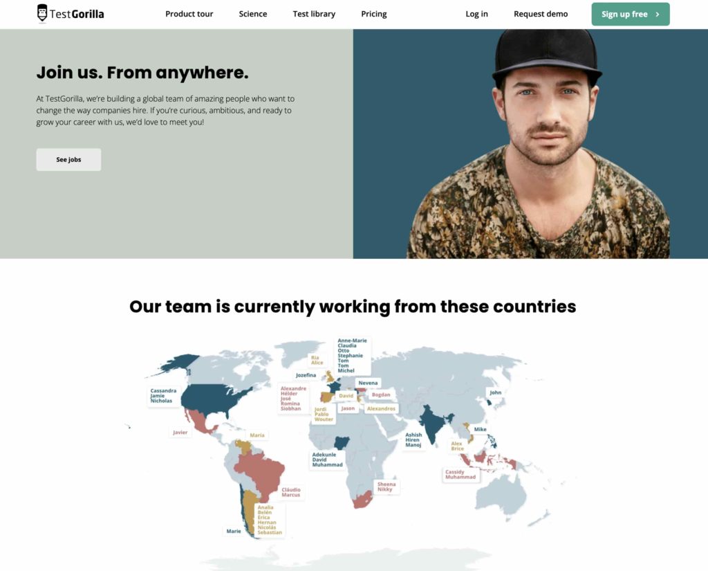
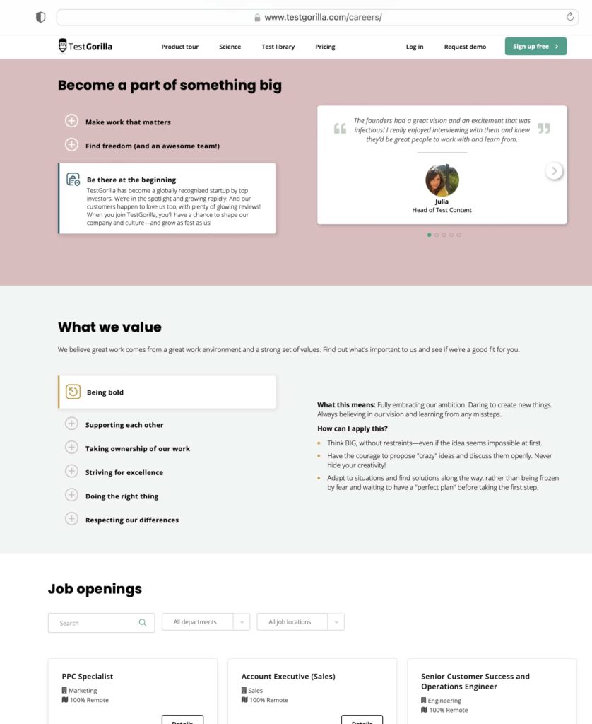
Here’s TestGorilla’s careers page for reference:
A career page usually provides the following details:
Information on available openings
Details on the organization’s culture: mission, vision, and values
Information about the various teams in the organization
Testimonials from previous and current employees, and clients working with the company
Details on the compensation and benefits applicants can expect
Videos that show the workplace or a regular day in the company
A career page isn’t limited to only that information and might feature other elements. Alternatively, some companies that have great career sites don’t even have all of these details. But these are the most common pieces of information you will find on a career page.
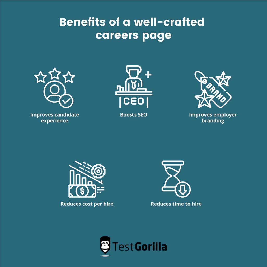
Benefits of a well-crafted careers page
When done right, a career page will have many benefits.
A career page will be an important source of information for your candidates, so make sure that you present what you do, what you stand for, and what you value in the right way.
A career site that is detailed, well-written and well-designed will show your candidates that you’re detail-oriented and value attention to detail and precision. A dysfunctional page that has missing elements or “lorem ipsum” text will show sloppiness.
So make sure that you present your company in a way that will attract the candidates you want to attract — if you want creative candidates, have a creative careers page, for example.
A well-crafted page will provide you with the following benefits:
1. Improves candidate experience
If a candidate opens your website and can’t find the necessary information on it, that’ll reduce your chances to get them to apply for a job. An even worse scenario is to provide all the necessary info, but have an Apply button that is difficult to find, or that simply doesn’t work.
When making a careers page, you need to think about the candidate experience and look at it from their perspective: what are the things that are the most important to my candidates and how can I provide them at the first point of contact (the careers page)?
A great careers page will help you create a good candidate experience and ensure that people who look at it feel motivated to apply for your open positions.
2. Helps boost SEO
You need to ensure that your job openings are seen by as many candidates as possible. And a good careers page will also need to be SEO-optimized so that it ranks better on Google.
This is not an easy task, but the return on investment is incredible. Consider this: if you’re ranked at one of the top three positions on Google, you will receive 55% of the search traffic for that specific keyword. The competition for these first three spots is fierce, but the results you will get from that, if you succeed, will be worth it.
That’s why it’s so important to have an SEO-optimized career page: with it, you can get lots of free traffic that will convert into candidates.
3. It improves your employer branding
In today’s marketplace, your employer brand is what separates you from other employers and your competition. A great careers page showcases your employer brand so well that you’ll receive job applications simply because of it.
Here’s an example of Celtra, a company that’s trying to find creative people and their careers page shows it.
Your employer brand serves to showcase your organizational culture, impress your candidates and demonstrate what your company has to offer in terms of workplace environment, compensation, benefits, and opportunities.
And with the millennial job market, it’s crucial to present your company’s brand, values, and vision to the world, if you want to attract and convert great candidates.
4. Reduces the cost per hire
A careers page can be a great way to reduce your cost per hire. You can use this part of the site to advertise your openings and your employer brand 24/7. With a site that is well-optimized for both search engines and visitors, you’ll be able to reach candidates from every corner of the world on an ongoing basis, while also keeping costs low.
You can also have direct interaction with your candidates via a chatbot that provides additional information to them and nudges them into applying for your open positions. This all contributes to reducing your cost per hire.
5. Reduces the time to hire
A great career page will help you reduce the time to hire a candidate. Anyone who applies to work for your company will instantly know what the company is about.
They’ll read on your career page your corporate mission, vision, values, and the description of the job that they’re applying to. That information will immediately help eliminate some of the candidates who wouldn’t be a good fit, and who would otherwise apply for the job without knowing anything about your workplace culture.
If you’re looking to hire a bookkeeper, for example, on your careers page you’ll need to provide details about the job itself, the team, and the company culture. If you’re looking for someone who is extraverted, because that’d make them a better fit, you could mention that in the job description.
This helps you save time, since you’ll receive applications from people who are aware of this requirement, and who feel they’d be a good fit. As a result, that will reduce the time to hire at your company.
The best insights on HR and recruitment, delivered to your inbox.
Biweekly updates. No spam. Unsubscribe any time.
Ten of the best careers pages (examples)
There are companies that have really great career pages. Usually, there are certain elements that make it so:
Compelling headlines that turn impressions into clicks
An “above-the-fold” section that sparks curiosity and keeps candidates reading further
A combination of videos and images
Attractive, well-written job ads that successfully sell the job (you might want to hire a copywriter for this, or have your marketing team craft the content)
Using storytelling to keep your visitors on the page
An easy application process
Social media icons/links to help candidates get a feel of your company
With that in mind, here are 10 examples of the best career pages out there:
1. TestGorilla
TestGorilla is a pre-employment skill assessment company that provides companies with the best tools to screen their candidates and make better hiring decisions.
TestGorilla has all the necessary elements that make a great career page:
An easy application process
A beautifully designed map that shows where the team is based
Testimonials
A well-defined culture code and values
2. HubSpot
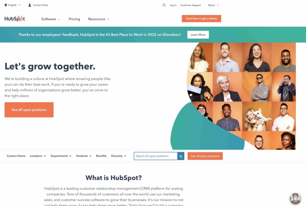
HubSpot is a customer relationship management (CRM) platform. Their career page has a couple of really great elements that make it one of the best career pages out there.
They have an embedded Instagram slide, as well as links to other pages where candidates can learn about their origin story.
But one thing that’s quite unique for them is their culture code — they have an embedded presentation of it on their career page, featuring HubSpot’s values, vision, and mission. And it’s not for the faint-hearted: the presentation has more than 120 slides!
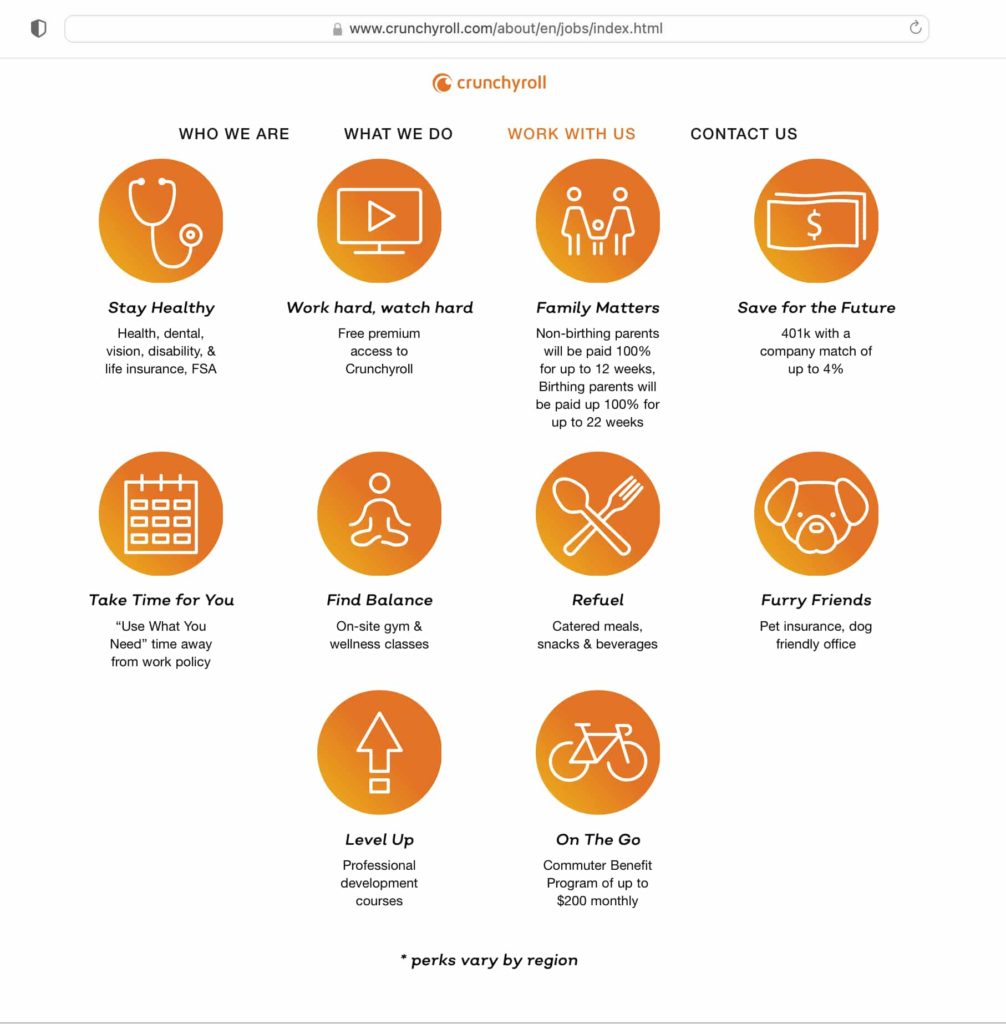
3. Crunchyroll
Crunchyroll is a manga and anime distribution company. Their career page is simple, yet super effective.
On it, they have listed all of the benefits of working for them, while on each job posting they have an application button that’s super easy to locate, and also a detailed description of what a day on the job looks like.
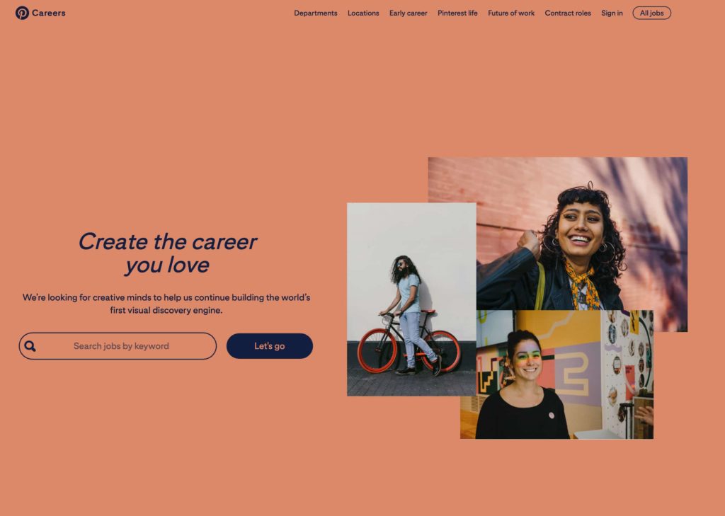
4. Pinterest
Pinterest has a creative career page that’s also interactive. You can click on cities to see the job openings at each location and it’s super easy to apply. They show what working at Pinterest looks like, with beautiful images of their employees’ everyday experience, as well as with employees’ testimonials.
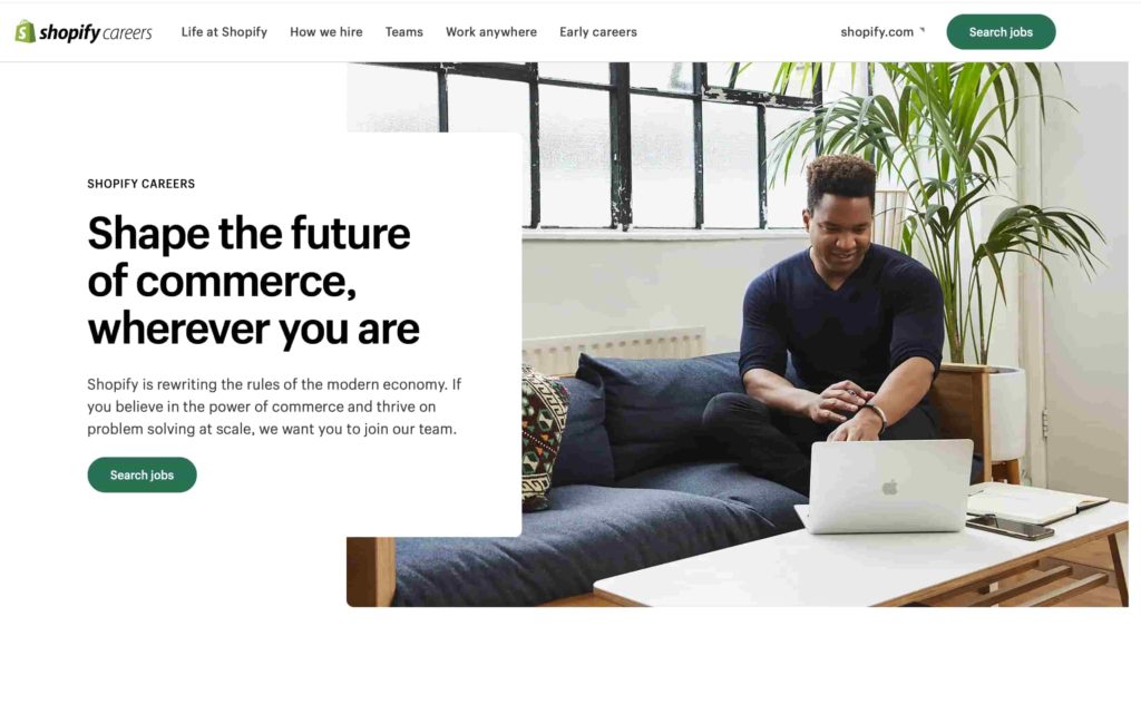
5. Shopify
Shopify is an e-commerce platform for online stores and retail systems.
Shopify’s career page uses storytelling really well, making the entire page look like a single, coherent story. There are parts where you can click to get more information, and all parts have been written with the candidate experience in mind.
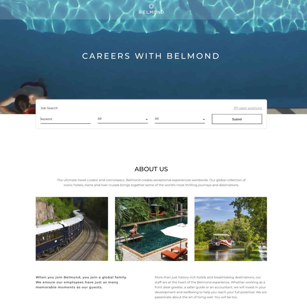
6. Belmond
Belmond is a company that operates luxury hotels, train services, and river cruises worldwide.
Belmond has one of the best above-the-fold sections when it comes to career pages. As soon as you open their career page, you see a beautiful image and a search bar with four different elements: keyword, team, location, and the number of open positions at the moment.
7. Mindvalley
Mindvalley is a personal growth learning platform based in Malaysia.
Mindvalley’s career page focuses on its mission to change the future of education. The entire career page is devoted to inspiring a sense of purpose, mission, and vision. And they back up their claims with rewards such as WorldBlu’s award for the most democratic workplace.
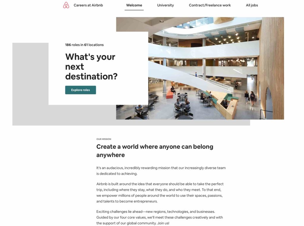
8. Airbnb
Airbnb is an online marketplace for holiday rentals.
Airbnb’s career page has some really great headlines. As soon as you open their careers site, you’re looking at a single sentence followed by an apply button: “What’s your next destination?” They know how to draw people in with their copy.
9. Hotjar
Hotjar is an online tool that helps companies analyze website heatmaps and provides them with detailed visitor behavior insights.
Hotjar’s career page has multiple videos that show the life and workplace environment at the company. They also explain in a concise graph what their application, selection, and recruitment process looks like. So the candidate knows how many steps they need to go through to get a job at Hotjar.
10. Slack
Slack is a business communication platform that offers chat rooms organized by topic, private groups, and direct messaging.
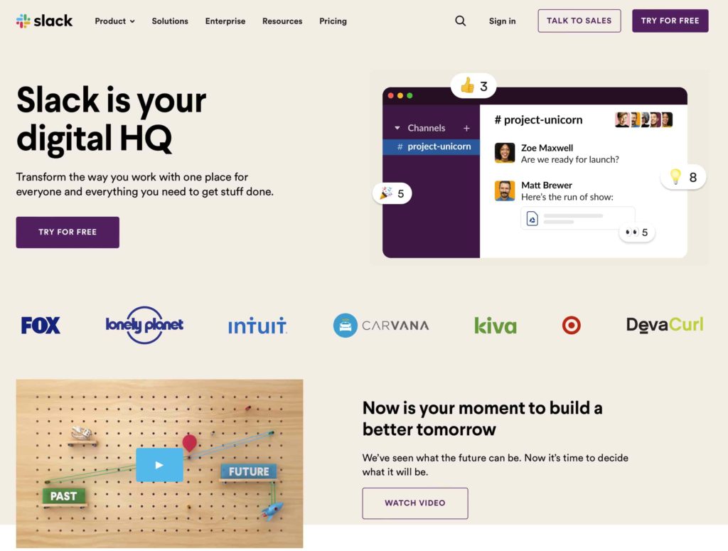
Slack’s career page has a good search tool that helps candidates easily find the job they want. Also, they describe their vision and the values they uphold in the first few sentences so you can see what they’re all about.
How to write a careers page: Tips and best practices
Now that you saw what some of the best careers pages out there look like, it’s time to go over some tips and tricks on how to write one.
It all starts with the three most basic elements that will make your careers page stand out:
1. Sell the role (and company).
The point of the career page is to sell the different roles to your candidates. Companies need to think differently about their job vacancies: instead of offering a job, they’re, in fact, trying to sell the job (and the company itself) to candidates.
2. Add your mission, vision, and values.
One of the main elements that a career page needs to have are your fundamentals— mission, vision, and values. With a mission and a vision, you’re showing your candidate where your company is heading in the future and what you are doing today to make it happen. With your values, you’re showing your candidate how you’re going to make that happen.
3. Use storytelling.
The visitors who come to your career page want to read a story about your company. It’s no longer just about the skills match — they want to read the origin story, where you are now, how you got there, and what you stand for. So use storytelling when creating your career page.
A career page is a window into your company
A career page is truly a window into what your organization is like and what it stands for.
You need to ensure that the candidates who land on it really get a feeling of what the company is like. For this, you need to include a few different elements: everything from the perks and benefits you offer, to the company culture, and your requirements for the role.
A career page is only one piece of the recruitment tools you have in your toolbox. If you want to learn what the other tools are, you should read your hiring team’s guide to recruitment tools.
You've scrolled this far
Why not try TestGorilla for free, and see what happens when you put skills first.

