45 CSS interview questions to hire skilled web developers
Whether you're looking to hire a web developer, web designer, or a front-end developer, proficiency in CSS (Cascading Style Sheets) is essential for creating beautiful, responsive, and user-friendly websites.
To help you assess your applicants' CSS knowledge effectively, we've compiled a list of the top 45 CSS interview questions, along with sample answers to 25 of them. These questions will give you a well-rounded view of candidates’ skills, from basic CSS concepts to advanced technical knowledge.
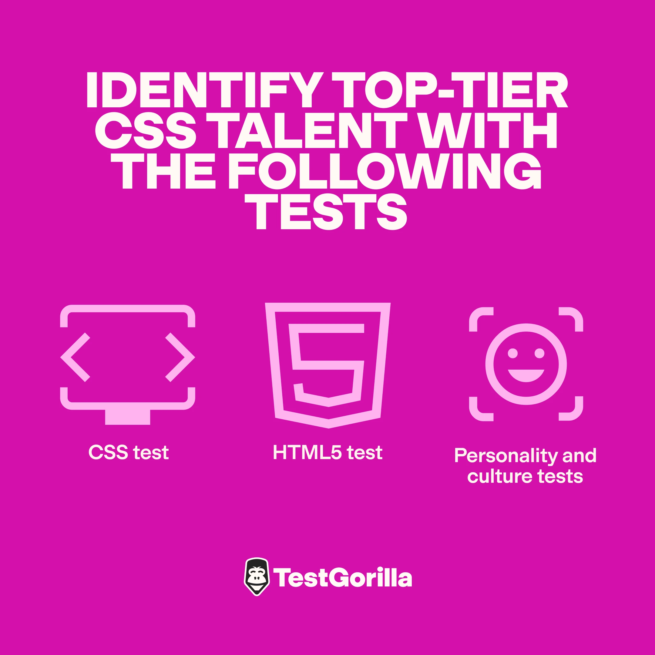
To identify top-tier CSS talent, combine these interview questions with skills tests such as our CSS test or our HTML5 test. You can also use personality and culture tests to see what makes your candidates tick and make sure they’ll fit well into your team.
Top 25 CSS interview questions to hire the best web developers (+ sample answers)
Below, you’ll find our selection of the best interview questions to ask candidates when looking to assess their CSS skills. They range from easy to difficult and we’ve included sample answers to enable you to interview applicants, even if you have no experience with CSS.
1. What are selectors in CSS? Can you give an example?
Selectors are patterns used to select the element or elements you want to style. They can be used to find elements based on their name, ID, class, attributes, and more. For example:
pis a type selector that selects all<p>elements..
navigationis a class selector that selects all elements with a class ofnavigation#headeris an ID selector that selects the element with the IDheader
2. Explain the difference between classes and IDs.
In CSS, classes and IDs are selectors you can use to apply styles, but they’re different in terms of specificity and reusability:
Classes are best used when you need to style multiple elements similarly. They’re reusable and apply to multiple elements on a page. For example, you could use
.buttonfor all buttons on a page.IDs are used for unique elements that appear once on any given page. IDs have higher specificity than classes, meaning styles applied with an ID override those applied with a class. For example,
#navbarwould be unique to the navigation bar.
3. What does “cascading” in Cascading Style Sheets mean?
“Cascading” in CSS describes the priority scheme that determines which style to apply to an element. It’s based on three main factors: specificity, importance, and source order.
Styles defined later in the CSS file or in a style sheet will override earlier ones if they have the same specificity. This system allows for styles to “cascade” down through layers of specificity and inheritance, giving developers control over the styling of web elements.
4. What are pseudo-classes? Give me a few examples.
Pseudo-classes are keywords added to selectors that specify a special state of the selected elements. They can be used to define a special behavior for an element in a particular state. For example:
:hoverapplies styles when the user hovers over an element:focusapplies styles when an element has focus:nth-child(n)applies styles to the nth child of a parent:checkedapplies styles to input elements that are checked, like checkboxes or radio buttons
5. How do you handle browser-specific styling issues?
Front-end developers usually handle browser-specific styling issues using:
Prefixes for CSS properties that require them, such as
-webkit-for Chrome and-moz-for FirefoxConditional comments, primarily for older versions of Internet Explorer
Feature detection libraries like Modernizr to apply styles if certain features are supported
Fallbacks, which provide alternative styles in case a browser does not support certain properties
CSS Resets, which normalize the styling across different browsers
6. How do you optimize your CSS for performance?
There are few strategies you can use to optimize performance in CSS, such as:
Minification: Reducing file size by removing unnecessary spaces, comments, and characters
Concatenation: Combining multiple CSS files into one to reduce HTTP requests
Using shorthand properties: Reducing the amount of code
Optimizing CSS selectors: Writing efficient selectors that reduce browser workload
Using CSS Sprites: Combining many images into one to reduce HTTP requests
Avoiding excessive use of CSS resets: Resets can be heavy, so it's better to use them only when necessary
7. Explain the concept of CSS frameworks. Can you name a few?
Knowledgeable candidates will explain that CSS frameworks are pre-written libraries that make it easier to design web layouts and components. They provide consistent styling across browsers and include reusable components, which speeds up the development process. Popular CSS frameworks include Bootstrap, Foundation, Tailwind CSS, and Bulma.
Looking for someone with top Bootstrap skills? Use our Bootstrap test to assess candidates.
8. How do you handle CSS for retina-ready displays?
To accommodate retina-ready displays, web developers can:
Use high-resolution media queries to display higher quality images
Use vector graphics like SVGs which are resolution-independent and scale without losing quality
Set CSS properties like background-size to ensure images scale correctly
Use modern image formats such as WebP for better compression and quality compared to traditional formats like JPEG
9. What new features does CSS3 have?
CSS3 introduced a few features for better web design, including:
Rounded corners
Box shadows and text shadows
Smoother transitions and animations without JavaScript
Multiple background images
New layout features, including Flexbox
Linear and radial gradients for smooth transitions between colors
10. How can you implement CSS transitions?
CSS transitions allow elements to change properties smoothly over a given timeframe.
To implement a transition, you need to specify the CSS property you want to transition, the duration of the transition, and optionally, the timing function and delay. For example:
div {
transition: background-color 0.5s ease-in-out;
}
div:hover {
      background-color: blue;
}
This CSS would cause the div's background color to change to blue over a half-second period when hovered.
11. What are keyframe animations? How are they different from transitions?
Keyframe animations enable more complex animations than transitions. Transitions apply a single change between two states, while animations can include multiple states at different timings using @keyframes.
12. What are SVGs? How do you use them with CSS?
SVG (Scalable Vector Graphics) is an XML-based image format for two-dimensional graphics that support interactivity and animation. SVGs are resolution-independent, which makes them ideal for responsive design. Plus, they display well on high-resolution displays.
In CSS, SVGs can be styled with properties like fill, stroke, and stroke-width. You can embed SVG directly in HTML or reference it as an image source and manipulate it with CSS for dynamic styling and effects.
13. How can you use CSS to ensure accessibility in web design?
To improve web accessibility with CSS, designers can:
Use scalable units (like em or rem) for font sizes to support users who need larger text
Ensure sufficient color contrast between text and backgrounds
Use media queries to adapt layouts to different conditions, like reduced motion or high-contrast modes
Hide elements visually without removing them from screen readers
Provide focus styles for interactive elements to for easier keyboard navigation
14. How would you approach fixing a CSS bug that appears in only one web browser?
To tackle a browser-specific CSS bug, a developer would need to:
Identify the bug with the help of testing tools and browser developer tools
Check if it’s a known issue with documented workarounds
Use conditional comments or feature detection (like Modernizr) to apply specific styles or fixes
Isolate the problematic code and experiment with alternative CSS properties or values to achieve a similar effect
Validate your CSS to ensure no errors are causing unexpected behavior
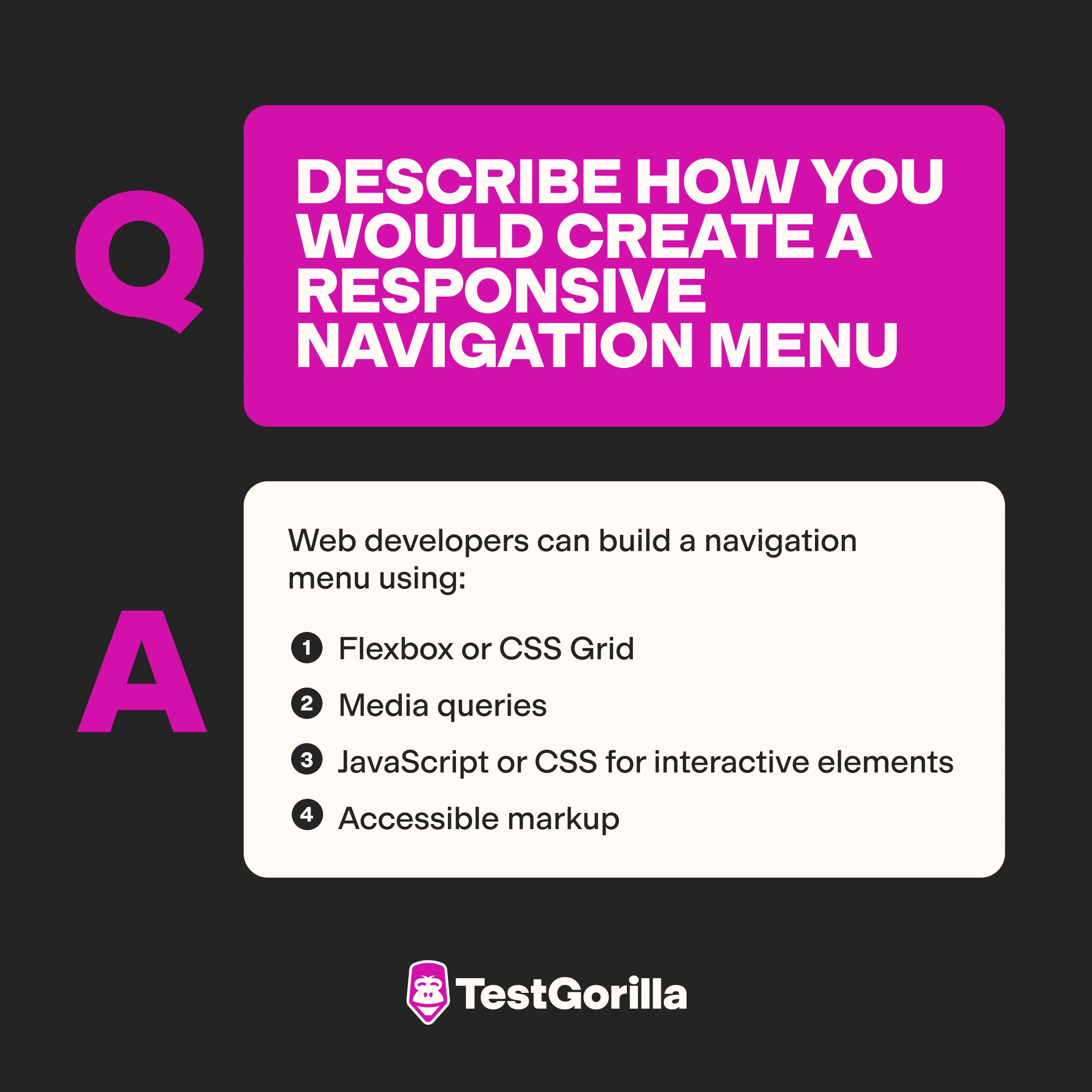
15. Describe how you would create a responsive navigation menu.
The answers of skilled candidates should feature a few approaches. Web developers can build a navigation menu using:
Flexbox or CSS Grid: These models adjust to different screen sizes, making it easier to design responsive menus
Media queries: This enables changing the navigation layout at different breakpoints, i.e. switching from a horizontal to a dropdown menu on mobile devices
JavaScript or CSS for interactive elements: Toggling the menu on smaller screens using a hamburger icon
Accessible markup: Ensuring that the menu is usable with keyboard and screen readers
16. What steps would you take to convert a fixed layout to a responsive design?
Responsive design is key for providing a positive user experience – and any web designer and developer should be able to convert a fixed layout to a responsive page. Here are the steps they should take:
Implement fluid grids: Replace fixed-width dimensions with relative units like percentages or viewport units to ensure the layout adjusts to different screen sizes.
Use flexible images and media: Apply
max-width: 100%;andheight: auto;to images to make them scale within their containing elementsUse media queries: Apply different CSS styles based on device characteristics like screen width, resolution, and orientation
Update navigation: Adapt navigation elements to be touch-friendly and suitable for smaller screens, potentially using a hamburger menu for smaller devices
Test on multiple devices and screen sizes: Check whether the layout performs well on various devices
17. How can you use CSS to make a page load faster?
To improve a website’s loading speed with CSS, developers can:
Remove unnecessary styles, comments, and whitespace
Combine and compress CSS files to reduce HTTP requests and file size
Use shorthand notation to reduce the size of the CSS code
Use CSS Sprites to combine many small images into a single file to reduce HTTP requests
Prioritize above-the-fold content using media queries to load critical CSS first
Use modern CSS properties like
transformover older properties like top and left for animations
18. How would you implement a custom checkbox using only CSS?
Here’s how to create a custom checkbox with CSS:
HTML code:
<label class="custom-checkbox">
    <input type="checkbox" hidden/>
      <span class="checkmark"></span>
</label>
CSS code:
.custom-checkbox input[type="checkbox"] { visibility: hidden; }
.custom-checkbox .checkmark { height: 20px; width: 20px;
background-color: #eee; display: inline-block; }
.custom-checkbox input[type="checkbox"]:checked + .checkmark { background-color: blue; }
This CSS hides the default checkbox and uses a span to create a custom checkmark. The :checked selector is used to change the checkbox’s appearance when it’s checked.
20. What are blend modes in CSS? How can you use them in web design?
CSS blend modes enable developers to specify blending effects between elements' background and their content or between an element and its background.
This is useful when manipulating colors, ensuring text visibility over different backgrounds, and creating visual themes. Skilled candidates will mention that blend modes are specified using the background-blend-mode or mix-blend-mode properties.
21. How do you handle DPI scaling in CSS?
Top applicants will know that to manage dots-per-inch (DPI) scaling, they can use responsive images with the srcset attribute, enabling the browser to select appropriate image resolutions based on the user device's DPI.
Alternatively, they can use vector graphics like SVGs, which scale well and provide crisp visuals at any resolution, or media queries that target high-resolution displays to increase font sizes.
22. What are some common security issues with CSS?
CSS has a low risk profile but skilled developers will know that some issues might still arise with it. Examples include:
CSS injection: Hackers can inject CSS into a page, altering its layout or using
background-urlto load malicious contentClickjacking: Transparent or opaque layers could trick users into clicking on elements they don't want to interact with
Security policies: Incorrectly configured content security policies (CSP) might allow attackers to bypass other security features
If you need someone with top cybersecurity skills, you can use a Cybersecurity test to further assess candidates’ technical knowledge of common web and network security threats.
23. Why are CSS style guide methodologies like BEM, SMACSS, and OOCSS important?
CSS methodologies like BEM (Block Element Modifier), SMACSS (Scalable and Modular Architecture for CSS), and OOCSS (Object-Oriented CSS) provide guidelines and patterns for writing CSS that improve the code’s scalability, maintainability, and modularity.
These methodologies promote top CSS best practices such as:
Reducing redundancy and increasing reusability
Easing maintenance and scalability by structuring code logically
Reducing specificity wars and improving performance
Use our Clean Code test to hire web developers who are able to write clean and easy to maintain code.
24. What is the difference between ::before and :before?
Top candidates will know that ::before is the correct and modern notation for CSS3 pseudo-elements and point out that :before was used in CSS2. The double-colon syntax (::) distinguishes pseudo-elements from pseudo-classes like :hover. Otherwise, both perform the same function.
25. How do you use CSS to handle text overflow in a container?
To manage text overflow in a container, a skilled developer would use the overflow, text-overflow, and white-space properties in combination:
.container { width: 200px; overflow: hidden; white-space: nowrap; text-overflow: ellipsis; }
This CSS will prevent the text from wrapping onto new lines (white-space: nowrap), cut off overflow (overflow: hidden), and display an ellipsis (text-overflow: ellipsis) to indicate truncated content.
20 additional interview questions to assess candidates’ CSS skills
Looking for more questions? Look no further.
Below, you’ll find 20 extra CSS interview questions you can use to evaluate future web designers’ and front-end developers’ CSS skills.
Explain how
position:relative,absolute, andfixedare different.What is the content property and how is it used with pseudo-elements?
Describe the CSS Grid layout. How is it different from Flexbox?
What is the use of the
calc()function in CSS?How can you make a website's layout responsive without media queries?
Can you explain the concept of CSS preprocessors? Name a few.
Can you create a simple animation using the
@keyframesrule?How would you implement a box shadow to create depth?
How do you use the clip-path property?
What are the benefits and drawbacks of using CSS-in-JS?
How can you overlay text on an image using CSS?
How do you use the
:notselector? Give us an example.What methods would you use to vertically center content in a div?
Explain the use of the
object-fitandobject-positionproperties.How can you use CSS to create a modal (dialog box)?
How do you apply CSS styles to a printed version of a web page?
How would you use the CSS aspect-ratio property? What are its benefits?
How is the
:rootpseudo-class different from thehtmlselector in CSS?What are some strategies for managing CSS in large-scale web applications?
How would you use CSS to create a custom-shaped button with complex shadows and hover effects?
If you need more inspiration, check out our front-end interview questions and web developer interview questions to hire top talent.
The best insights on HR and recruitment, delivered to your inbox.
Biweekly updates. No spam. Unsubscribe any time.
Hire top web designers and developers with the right talent assessment strategy
To find and hire the best web developers, you need a solid recruitment process that helps you quickly and efficiently narrow down your list of candidates.
For this, use our CSS test along with other skills tests adapted to the role you’re looking to fill. Then, invite top candidates to an interview and ask them targeted CSS interview questions like the ones above to further assess their skills.
This skills-based approach to hiring helps predict on-the-job success better than resumes alone, according to 89% of employers we surveyed last year.
Book a free live demo to chat with our team and learn more about the benefits of skills-first hiring – or sign up for our Free forever plan to build your first talent assessment today.
Related posts
You've scrolled this far
Why not try TestGorilla for free, and see what happens when you put skills first.


